Below are a variety of images of work I have created through a series of projects during this year. The Foundation Pre Degree course has enabled me to open up fresh ideas and ways of making images. For example some of the images below are a direct result of playing with the notion of “ping” and “pong” as a mark making activity. This was quite a surprise as I began to develop my mark making ideas into a series of prints, I started with mono prints and then began to develop them using shapes as masked areas within the prints. By gradually overprinting I was able to develop some of my favourite images. From this I can see developmental opportunities that could be taken into textiles.
Whilst on the course I have had the opportunity to work with textiles and have enjoyed this, so much so that I am applying to your course. Being involved in a textiles environment would appeal to me as it is such a rich and diverse field. I would like to know more about the business side of textile production as well as developing and creating my own work. I realise that there are many aspects of working in the textiles industry that I have yet to experience, I would hope that your course would introduce me to many of these.
My present course has offered a lot of challenges such as life drawing and colour mixing which take a considerable amount of concentrated effort and discipline.
On a lighter note I was able to visit Florence and Siena. At the Uffizi gallery I was interested by the work of Sandro Botticelli, particularly the painting called the Birth of Venus.
Colour Prints
These prints show how I have used contrasting colours into a set of prints to again develop my ideas further. To do this I had to mask out areas of the print before adding inc, I then added inc into the mask areas therefore creating the following design. I like how both compliment each other due to colour.

Colour print
The following print is a development of a series of mark making drawing's I have previously done in mono prints, from them I created shape and here I am showing a series of complimentary colour with controlled mark making. I like the variety of shapes in this print and how there is variation of colours in the background. 

Colour print
This print was created from stencils being inked up then printed onto the background. I think this is very effective and works well due to the outstanding colours chosen, this also shows how my ideas have developed.

Lino prints

Here is one of my final outcomes of the projects, from mark making to shape into a variety of compositions on lino prints. I really like how all these colours work together. As Ihad to complete a colour book this helped me during this process as I was able to mix a variety of different colours and tones to create the following prints.
Large Scale Painting

This piece above is created using a series of mark making, showing shape, line and tone. Throughout we can see how certain lines soften and sharpen the shapes so that some shapes stand out . I first started just working with various tones of grey and then i added tones of purple in areas that needed to stand out. I am very happy with this composition as it helped be discover shape and tonal range.
Textiles Compersitions
I here have shown a variaty of textiles tecniques to follow on from my prints with various mark making, i have interpritated the marks and shown this through various stitching and applique of fabric. I like the contarsting colours used on the compositions and how variouse tones of Green and Red also relate.

Textile compersitions

Here is the same sort of idea but I like the way each piece is different how I have varied the the tecniques, I like the way the use of print on top of the sewing works well in keeping with mark making.
Series of Experimentational Prints
Here I have experimented with different ways in which I can work in print, I have shown the variety of colour and the technique of stenciling. I have then taken the prints though a photography process creating a photo gram showing the negative colours. Below shows experimentation with several etching techniques again showing shape, line through mark making and tonal quality's depending on how much inc is applied to the etching card.
I therefore am very happy with the prints as I think they look very effective and shows my development of ideas.

Development of Ideas
This shows how I have developed my designs using a variety of media, I first took the design and repeated it, overlapping and using tonal quality's throughout using pencil and pen to shade. I then added colour and carried on using tone I really like this piece as I think the colour's work really well together and the variety of shape and line works well. I then began to experiment with photography using personal objects to start off with to see what the results would be. I was very happy with the photo grams and then i decided to use this
technique to develop my ideas further. 

Development of Prints
Several Lino prints using a variety of colours that work really well together, I like the marks made on the lino that creates the shapes, and how the colours work well together with a variety of contrasting and complementary colours. I really enjoyed working with lino due to the fact that colour can be layer up to show a variety of colour. To develop my prints further I began to sew into them also to add texture.

Newspaper Tutu
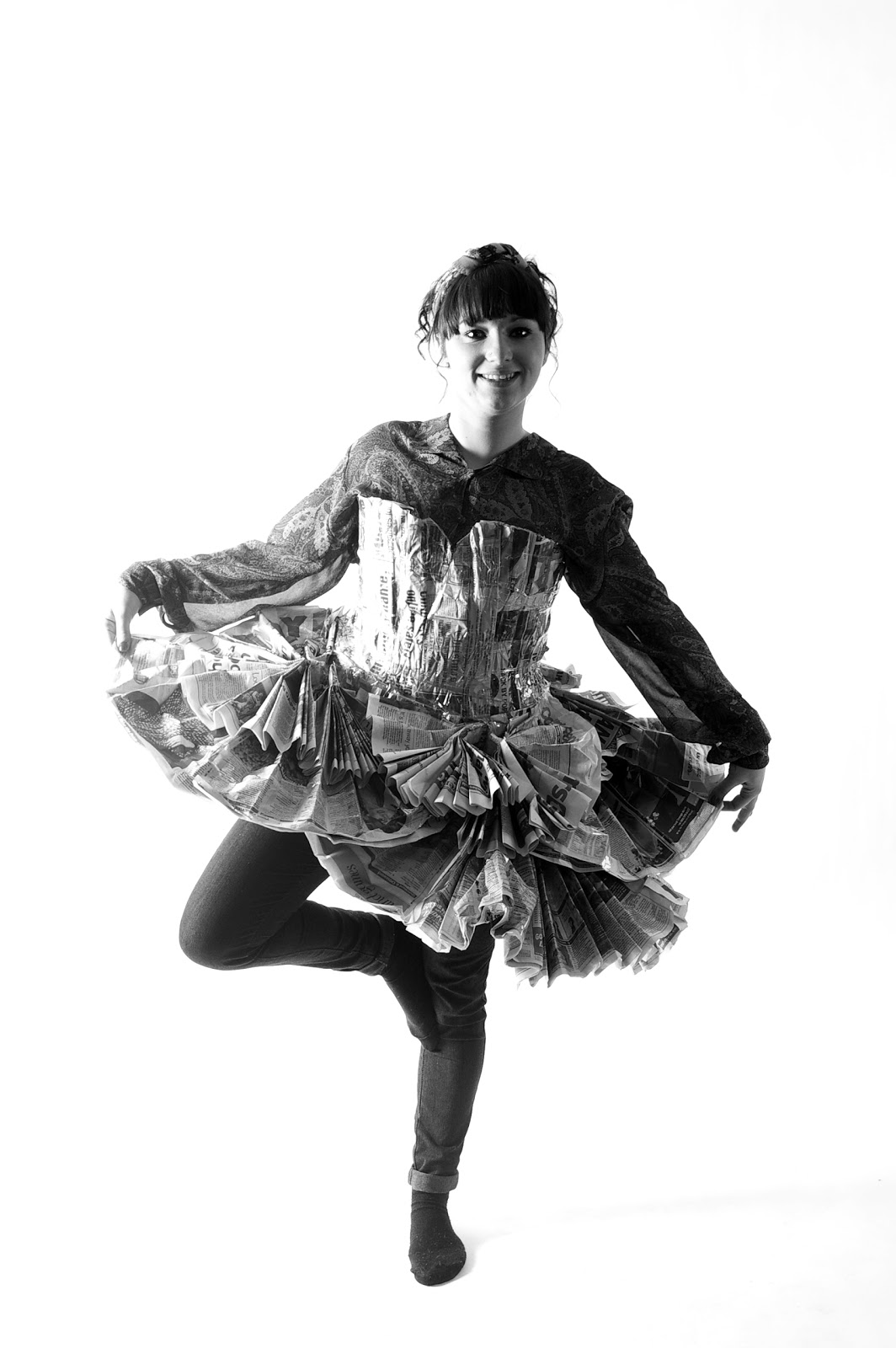
A project aiming at recycled materials, the brief was to create a tutu out of newspaper. I really enjoyed this project discovering ways in which the material works best and making sure it didn't rip. I have here shown structure and layering of materials to form a fuller and sustainable product.
Life Drawing

This is an image of my life class drawing, showing proportional drawing and wieght of line.
At the start of the course I found life class hard but as I have continued every week
I feel more confident and I enjoy it.
Subscribe to:
Posts (Atom)